Anthony Cudahy: Spinneret - Exhibition Design
Client
Ogunquit Museum of American Art
Year
Spring 2024
Organized into a series of thematic groupings, Anthony Cudahy: Spinneret explores the artist’s intricate visual language, weaving together personal memory, art history, and the ephemeral connections that bind us. Originally presented at the Ogunquit Museum of American Art (OMAA), the exhibition’s graphic identity—anchored by the evocative “Blood Orange” typography—was conceived to echo the vintage sensibility and layered narratives within Cudahy’s work.
Reflecting the exhibition’s themes of interconnectedness, the graphic design became a visual thread, traveling with the show as it moved from OMAA to the Green Family Art Foundation in Texas. The nostalgic feel of the “Blood Orange” typeface, paired with Sabon LT Pro for body text, references the past while serving as a connective tissue, linking the two venues and audiences across regions. Just as Cudahy’s paintings invite viewers to trace relationships between figures, spaces, and histories, the exhibition’s design forms a bridge—an ongoing dialogue between place, artist, and viewer.
You can find the show’s catalogue for sale here.


Color in Cudahy’s Paintings

Color is central to Anthony Cudahy’s practice, functioning as both a narrative force and a character within his paintings. He approaches color relationally, layering and blending hues to create complex, emotionally charged compositions. Cudahy’s palette is known for its richness and restraint, often juxtaposing muted tones with saturated, glowing colors that evoke a sense of nostalgia and introspection.
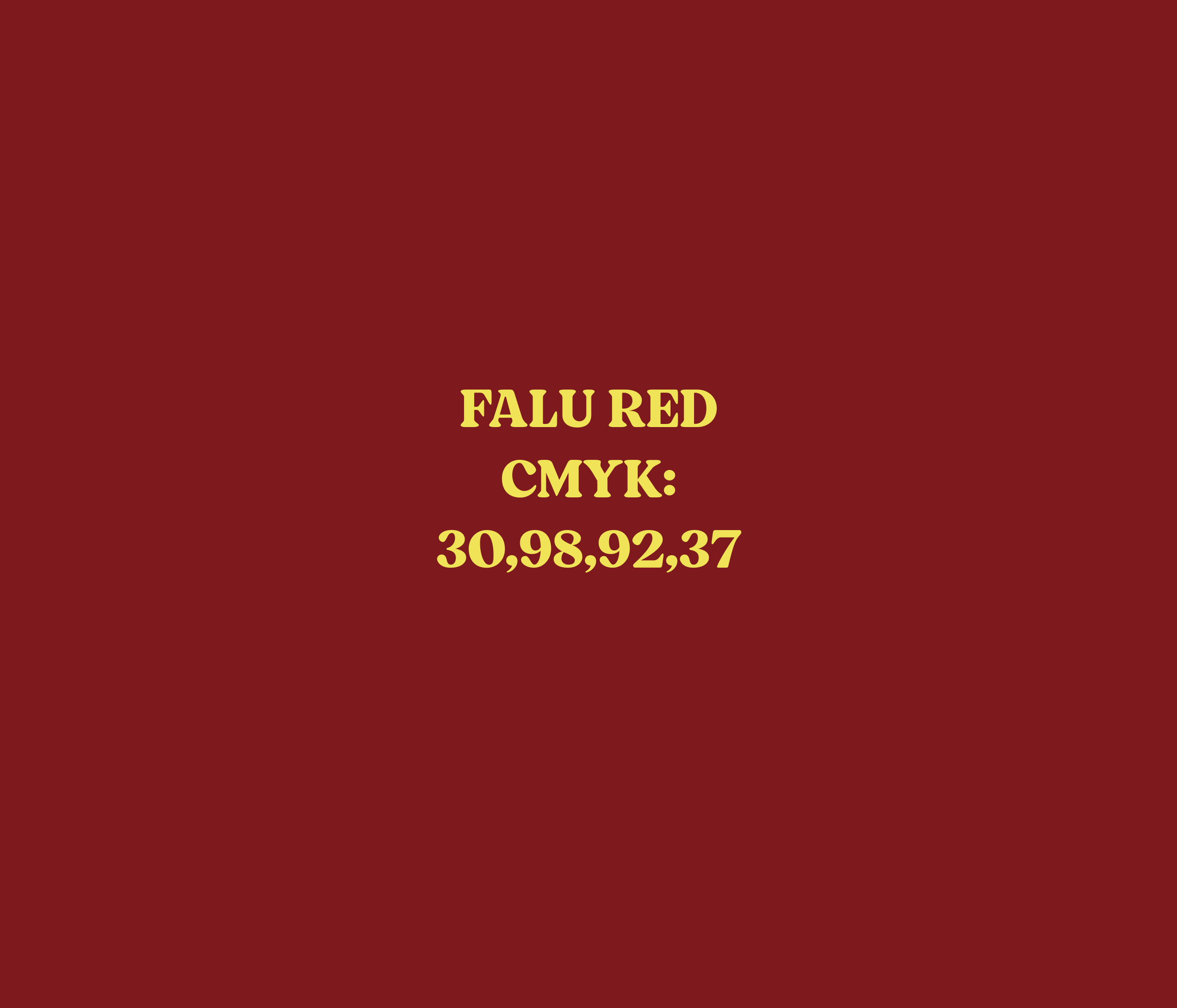
For the exhibition, the design palette drew directly from the vibrant reds and hints of yellow found in paintings such as Against Gardening!, Oil on linen. The deep crimson, Falu Red, (#7e191d, CMYK: 30,98,92,37) and luminous yellow, Maize, (#f0e357, CMYK: 8,4,80,0) were chosen to reflect the phosphorescent quality and emotional resonance of these works. The interplay of these tones in both the paintings and the exhibition materials creates a visual dialogue, mirroring the way Cudahy’s colors bleed and interact on canvas. This deliberate use of color in both art and design enhances the show’s atmosphere, inviting viewers to immerse themselves in the nuanced worlds Cudahy constructs.
Promotional Collateral
As lead designer for Anthony Cudahy: Spinneret, I developed the exhibition’s visual identity, including all advertising and invitation materials. By integrating the signature ‘Blood Orange’ headline typography and a color palette inspired by Cudahy’s paintings, I ensured that every touchpoint—from print ads to opening night invitations—reflected the show’s thematic depth.


